Photo shoot 4

The use of colour is light at the top and darker at the bottom the tone looks soft. There is detail in the tree but it is also quite a simple piece. The subject matter are the two people in the picture who are my peers Mia and Chanel. I was inspired to do this because I quite like Oliver morris' work and how he blends humans in with nature i think that it shows the beauty of life and how its simple. This has been created by putting the settings on the cloudy settings on the white balance. The aperture for the background picture the tree is on F5.6 and the shutter speed is on 1/100. The mood looks quite calm. I have edited this photo on photo shop by layering the photos and having the opacity on 50% and changing it to pin light, I chose that because I liked the colours of it and it shows what I wanted to create and relates to the artist I have chosen and the topic which is multiple images. I think that the colours are quite suttle but there is more depth near the bottom. I think there has been a slight improvement since my first photo shoot with the colour and they've blended well together.
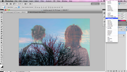
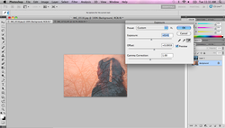
Here is a screen shot of the process of me editing the photo on photo shop. To layer the photos I opened both of the images on photoshop I then selected the image of Mia and Chanel and drag it onto the other image of the trees. Once layering the photos together I played around with the colours to do this I went to image, adjustments then to brightness/contrast and played around with that to see what looked the best. I then went to the right where the pictures are layered then I clicked on the drop down box which has normal written their then I changed it to pin light I liked that so I went with that for my final edit. I like the blue sky and how the two photos go well together. The work was created not long ago on I photo shoot I had done in the christmas holidays. The two people in it are quiet faint which I think looks effected how they have faded away into the background.

Here is another one of my final three photos from the shoot. The colours contrast each other and they blend together well and the mood and energy is quite relaxing and calm. The subject matter of this photo is another one of my peers Anna. Using the rule of third the tree covers up most of the background then I placed then main subject matter on the side making her darker so it shows contrast in this double exposure. I like how the nature blends into the humans and it shows human nature and how we are pure.
Again here is one of the steps of the process of creating my final edited piece. I changed the exposure the trees are more faded out compared to the original picture. The layers is on overlay and the opacity is on 50% and the fill is on 100%. I layered the two photos and played around with the exposure to see what would work and I liked how the two colours go together because they contrast.

Here I have layered three photos together. The colours vary, there is a lot of blues, yellows and dark colours in this photograph. The top layer is the picture with them holding hands which represents friendship. The second layer is Chanel and Mia I have made the opacity rather faint. I screened the image before putting the third image over the top. I'd say this one is more detailed compared to the first one because more of the tree is covering the whole background on the first image of this photo shoot there is more sky involved. I like how the branch cutting through the middle stands out.
critique by peer Rachel Hart
You have chosen a good opacity showing the two people in the photo and the contrast between the colour of the sky and the brain hair is good as they stand out but also you can see the clouds behind them and you can clearly see the tree. Something you could improve on could be to play around with the contrast of the photo to give it more depth. This photo blends well together as the tree background is visible throughout the person. I think it portrays what you have said calming and relaxing, the colour choice shows this as well. To improve you could change the angle of the person to show more of the person. The message in this picture is clearly shown as the holding of the hands and the two people in the background. The colours contrast well together and the opacity of each photograph works well together. To improve you could change the colours around to see if you can get a different mood/feeling of the picture.
You have chosen a good opacity showing the two people in the photo and the contrast between the colour of the sky and the brain hair is good as they stand out but also you can see the clouds behind them and you can clearly see the tree. Something you could improve on could be to play around with the contrast of the photo to give it more depth. This photo blends well together as the tree background is visible throughout the person. I think it portrays what you have said calming and relaxing, the colour choice shows this as well. To improve you could change the angle of the person to show more of the person. The message in this picture is clearly shown as the holding of the hands and the two people in the background. The colours contrast well together and the opacity of each photograph works well together. To improve you could change the colours around to see if you can get a different mood/feeling of the picture.
| contact_sheet_multiple_images_2.pdf |
| photoshoot-planner2-33_(3).docx |
