
The subject matter of this image is the castle. The use of colour is green with a black background I didn't have a green light I had a normal torch then edited the lighting to green on photo shop. This work has been created in a dark room. After doing some research on different artist I found the technique on how to do light photography. To create this I had the shutter speed on BULB so I could take as long as I wanted to create this image. I had the ISO on 200 and the aperture on F.22.
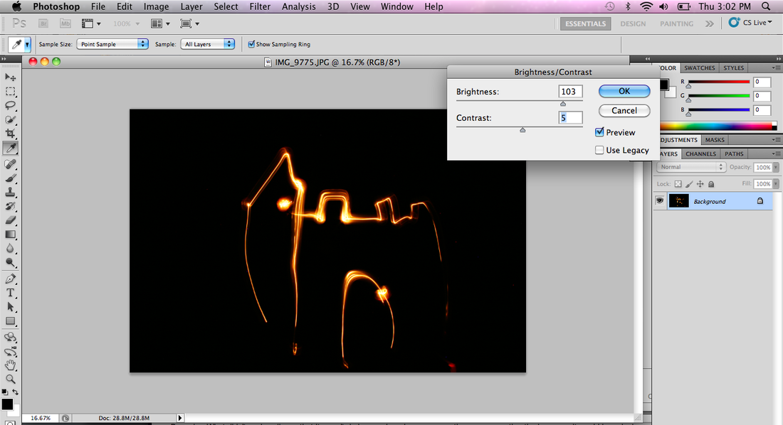


I went on to photo shop to edit the photos I have taken. To get to my final outcome I first of all went to image, adjustment, brightness/contrast I then adjusted the brightness so that it's brighter. Then I went to image again, adjustments, hue/saturation and changed the hue to around 80 so it changed to green. I also then changed the saturation to about 80 as well.

I like the colour in this image, I like how it's a kind of a purple and how it's brighter at the top. The shape of this isn't as simple and basic like the other images I created. This one has an interesting composition. The subject matter is the line of hearts underneath each other and the dangly waves coming from the bright spots. This work has been created in relation to the movement project and I liked an artist work and the technique which I wanted to explore and test out myself. The settings that my camera were set on to create the image is the same as the image above. I think that the image is quite crisp looking. The colour is quite vibrant and stands out because of the black background.


Here is two screen shoots i have taken whilst editing the photo. I first of all opened up the image on photo shop then I went to image, adjustments, when to brightness and contrast and just changed the brightness to around 80 again so the lighting is brighter because it looks better than it being dull. Then after that I went to image, adjustment, hue/saturation. I changed the hue to the minus section like in the middle of the red/yellow so that it creates a purple colour which looks good. None of my final pictures from each photo shoot are in colour because I only realised that you could change the colour near the end of the project so it's disappointing because I do like the out come of these photos and I wish I could of explored more.the photo looks like it has a positive feeling because of the bright colours.
