Photo shoot 1

Here I am seeing a sun set with an human figure over the top with the background image standing out more inside the persons figure. I like the use of colour it's a mix between light and dark near the bottom because the sun has gone behind the trees. The composition of this photo is the sunset in the background with another image over the top. For this photo shoot I got my brother Aaron to take part, I simply got him to look at the camera which makes it look effective. I layered the image together so it's a double exposure and it makes it a multiple image because two images is used. The subject matter is the person in the middle of the photo. The surface of the work looks quite smooth, I like this image because there isn't too much going on.

This image shows a lot of contrast and the images are layered the subject mater is the person in the middle of the photo which is slightly to the side which I like because he is facing the other way. If I was to do this again I would move the person more to the right so it's more in the middle like Oliver Morris.

This image is like the top one but a different pose. I decided to place him more to the left of the photograph. The sun set, sets a warm summer feeling the colours are bright three quarters of the way down fading into the dark trees showing the sunset. I like how he isn't looking directly at the camera and that his face is quite faint.
| photo_shoot_4_multiple_contact_sheet.pdf |
| photoshoot-planner2_(19).docx |
contact sheet analysis
The photos here are a different selection of trees and a sunset. The model I have got done a different range of poses which aren't all completely serious which I like. I would next time get a different range of trees and more close ups
The photos here are a different selection of trees and a sunset. The model I have got done a different range of poses which aren't all completely serious which I like. I would next time get a different range of trees and more close ups
Critique by peer
Overall very good, good selection of colours they blend well together. Rule of thirds generally stuck to although maybe crop some un-necessary space around edges of photos. Blend top layer with background more in the 2 photos.
Overall very good, good selection of colours they blend well together. Rule of thirds generally stuck to although maybe crop some un-necessary space around edges of photos. Blend top layer with background more in the 2 photos.
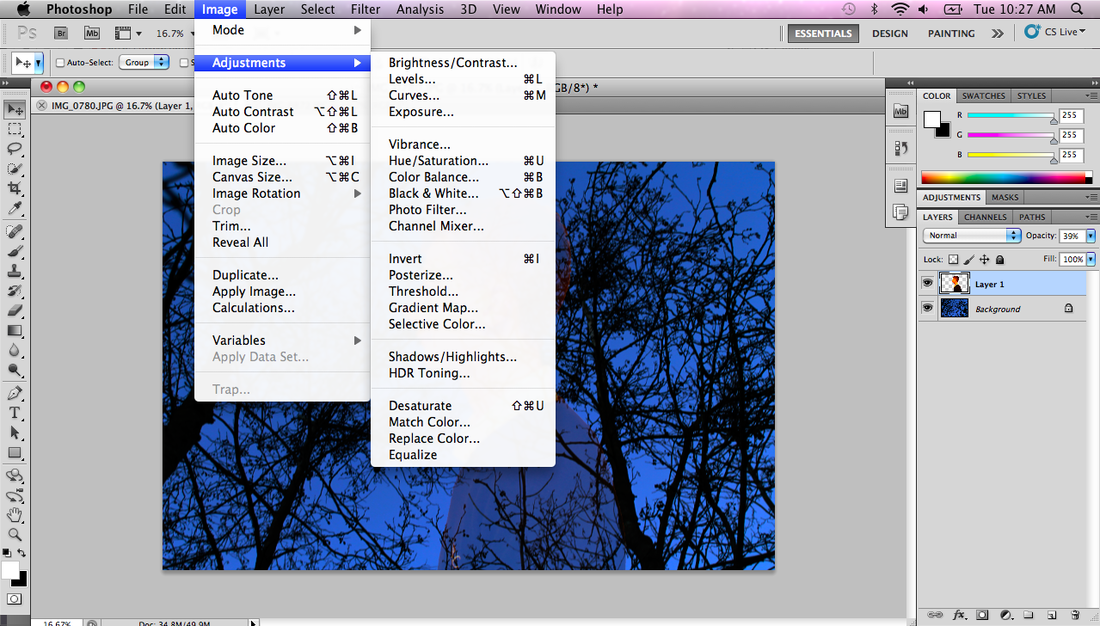

I layered the two images and changed the brightness and contrast of it so that the sky became darker and the trees stood out more. I then used the rubber wand tool on the left to get rid of the excess picture for around the person I then clicked control d to get rid of the selected area then I changed the opacity and scred the image I also changed the contrast to below 0 so that his face stands out more.


To do this I opened to photos I then got rid of the excess of the second photo around the person I had to use a tool from the left hand side and selected the stuff from around the person and deleted it. I then dragged it onto the other image and changed the opacity I like how the outside of the photo is more faint which make it looks more interesting.


To create this image I layered the two by dragging the second image on top then changed the opacity of the second layer to make it more transparent. I changed the opacity to less then half way and changed it from normal. I left the background photo because I feel the colours didn't need changing and I like it.
